
Hello everyone, I am purewatches. Today I want to talk to you about the Submariner character in the Submariner series. There are many versions on the market. Judging from the scale, there may be more than 30 factories producing the Submariner series. But there are only two companies with truly outstanding craftsmanship, one is VS and the other is C factory. So, today I want to discuss with you, in the comparison between C factory and VS, which one will gain more advantages?
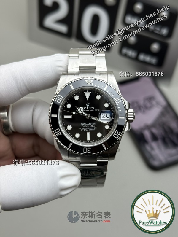
First of all, Factory C has done an excellent job in appearance design, and its disk layout is also quite reasonable. Secondly, VS has obvious advantages in movement design, mainly because its power output can last for 70 hours. These two points are the main differences between them. But for our toy watch, we pay more attention to the subtleties of appearance. As for the quality of the movement, Factory C has done a very good job in appearance design, and even performed quite well in terms of movement. Although it is slightly underpowered, there are no major problems in other aspects. Therefore, for daily wear, we may be more inclined to recommend the C factory version. So, how to identify the specific version of this C factory? In view of the excessive number of imitation woven C on the market, we need to conduct an identification. First, we must understand the subtleties in depth. Let us continue to observe.
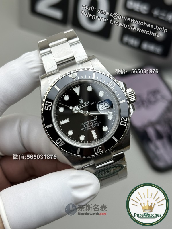
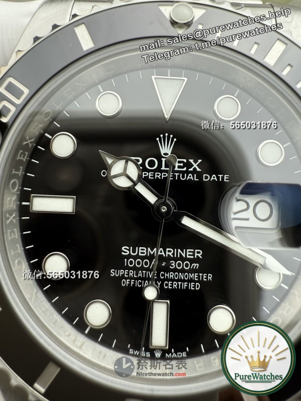
First of all, the overall material of this product is 904 stainless steel, which makes it look a bit whitish. But if you choose the 316 model, you will find that its surface appears rougher when stretched. Therefore, you need to pay special attention, and there will be no big problems in other aspects. In addition, we also need to carefully observe the entire disk. The black part has no color difference at all. Please remember this. Next, what we want to pay attention to is the ceramic ring. Its scales are filled with luminous light and the color is platinum gray. If the color is too white or too silvery, it may have a matte-like texture. In addition, we need to pay special attention to this night pearl. For luminous pearls, their height has a certain impact. If the height is too high or too low, its shape will be less than ideal. A good height is rounded, not sharp. Its color has a jade-like texture and is neither white nor yellowish. It is worth noting that its shape is very important, including an inverted triangle and a dot, and the proportions of the inverted triangle are also just right, so this is particularly important.
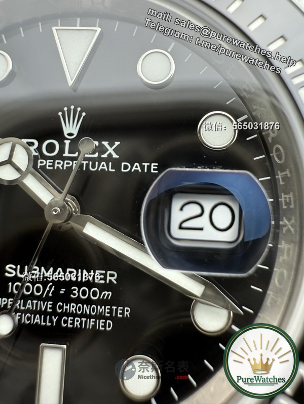
When performing rotating movements, the hand does not get stuck and remains smooth. It’s not that it’s particularly light, and there’s not too much looseness. If there’s too much looseness, the match won’t be good. So we must understand that the transparency of this mirror is also quite high. The edges are all transparent, which is a pretty good design. What we’re paying special attention to is the bottom bracket, which is solid but still has some small hollows on it, which is normal. In addition, its hat shape is also made. As you can see from the edge of the pointer, it has no unnecessary burrs, which is very critical. In addition, the three-point bubble mirror also has a blue film. We have to figure out the specific shapes in the calendar because the font fills the entire calendar window. There are definitely some minor flaws in the small factory version of the calendar. When we rotate the calendar font, we will find that the numbers have tails and hooks. These other small workshops cannot do this. You can carefully observe the debugging process and compare it from many aspects. Factory C can basically be said to be the one closest to the original product!
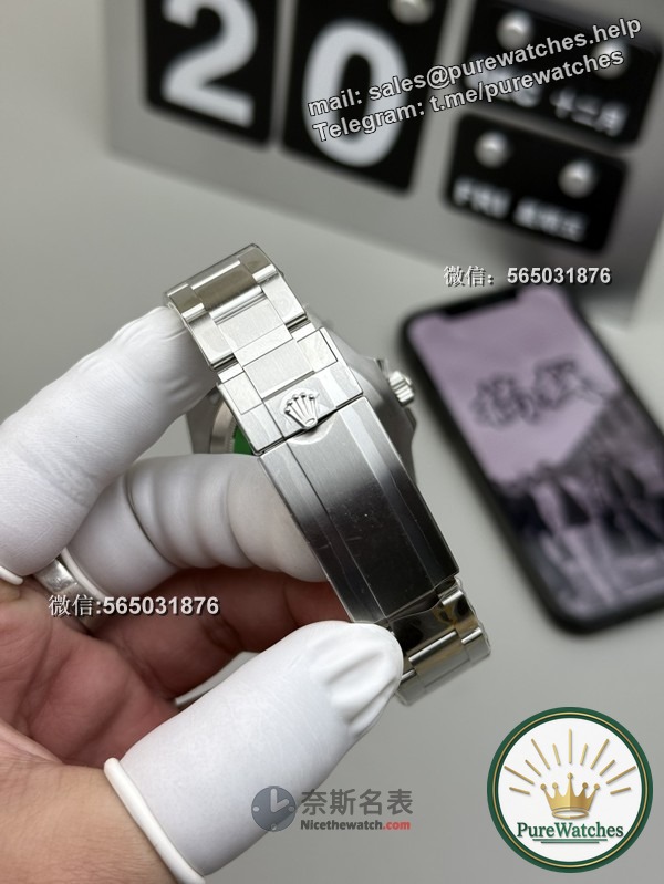
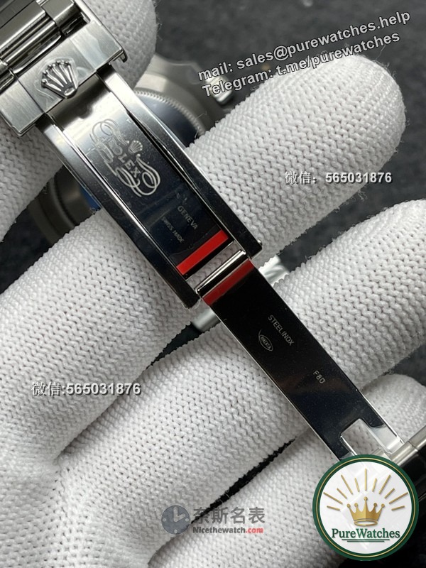
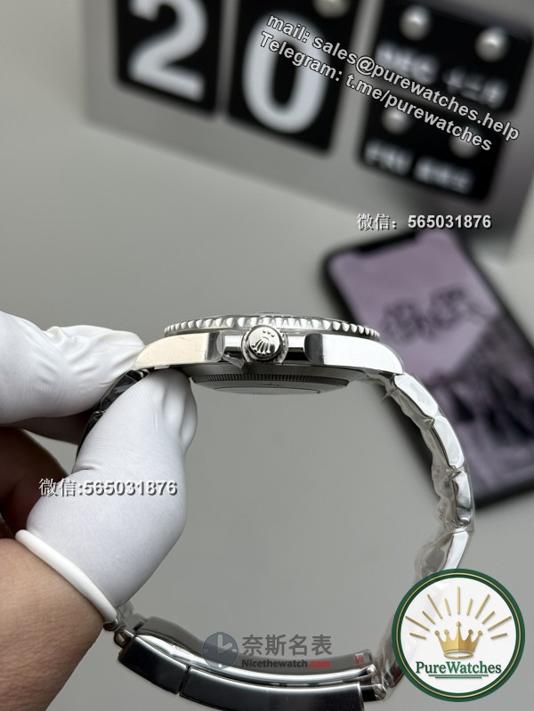
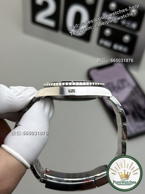
Next, let us take a closer look at one of its strap features, which is that the brushing process is quite fine, the edges are polished, and you can also observe its chamfering. I did a pretty good job using F80 as the latest codec, and although I frequently replace it with expensive codecs, F80 is still used very frequently in the current market. Its spacing remains the same and it’s very clear. While its notch may be a little subtle, it’s definitely unmistakable. Looking at the sandblasted interior, you’ll notice some noticeable imperfections, especially on the bottom cover. Here we can take a closer look at the pattern without caring about the specific pattern. Since Factory C often changes stickers, our main concern is whether there are no unnecessary gaps on the bottom cover and whether the details are in place, especially the head on this end, which has almost no gaps. As long as you stick to this watch head, it will give you a clear display with basically no problems.
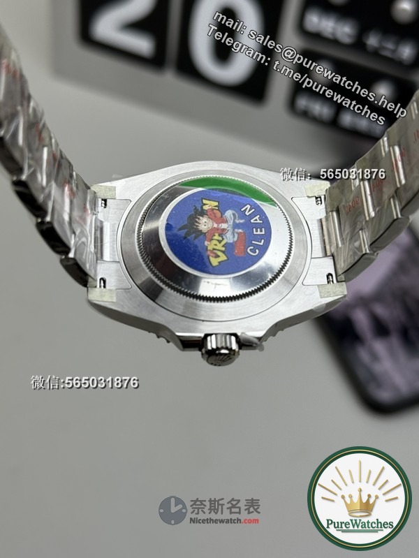
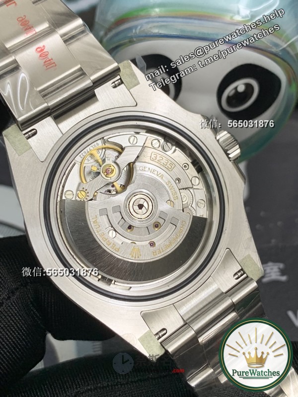
From the perspective of the movement, this is a 3235 movement originating from Shanghai. Its clockwork design is to rotate clockwise, that is, to skip the calendar clockwise. You need to make this clear. If you’re in a time-setting situation, just turn it counterclockwise to keep time, and you’ll understand. Similarly, if the direction of adjusting time and calendar is wrong, it is basically wrong. Of course, there are many details we need to pay attention to, including its internal shadow encoding. In the future, you can ask the merchant to open the bottom cover and ensure that the movement matches the code, so there won’t be too much of a problem. In this way, unnecessary fraud can be avoided.
Well purewatches thank you for seeing this. Popularize watch culture for everyone, play with watches transparently, and fill in the pits for your watch play all the way. Professionalism comes from concentration. I hope this article will be helpful to you. I hope to bring you more new news and knowledge in the future. purewatches is here to thank everyone for your continued attention and love!
Scan or click to identify the QR code to go directly to the purewatches base camp: